Core Typography Studio Fall 2022
Critical Reading OrderWikibook
PDF Portfolio
M 12.12
Please respond to the following two polls:
Grading Policy Ratification Vote
Dietary Restrictions
M 11.14
CRITICAL READING (for M 11.21)Zines as a Medium for Community Building
Discussion Captain: Sizhen
ASSIGNMENTS
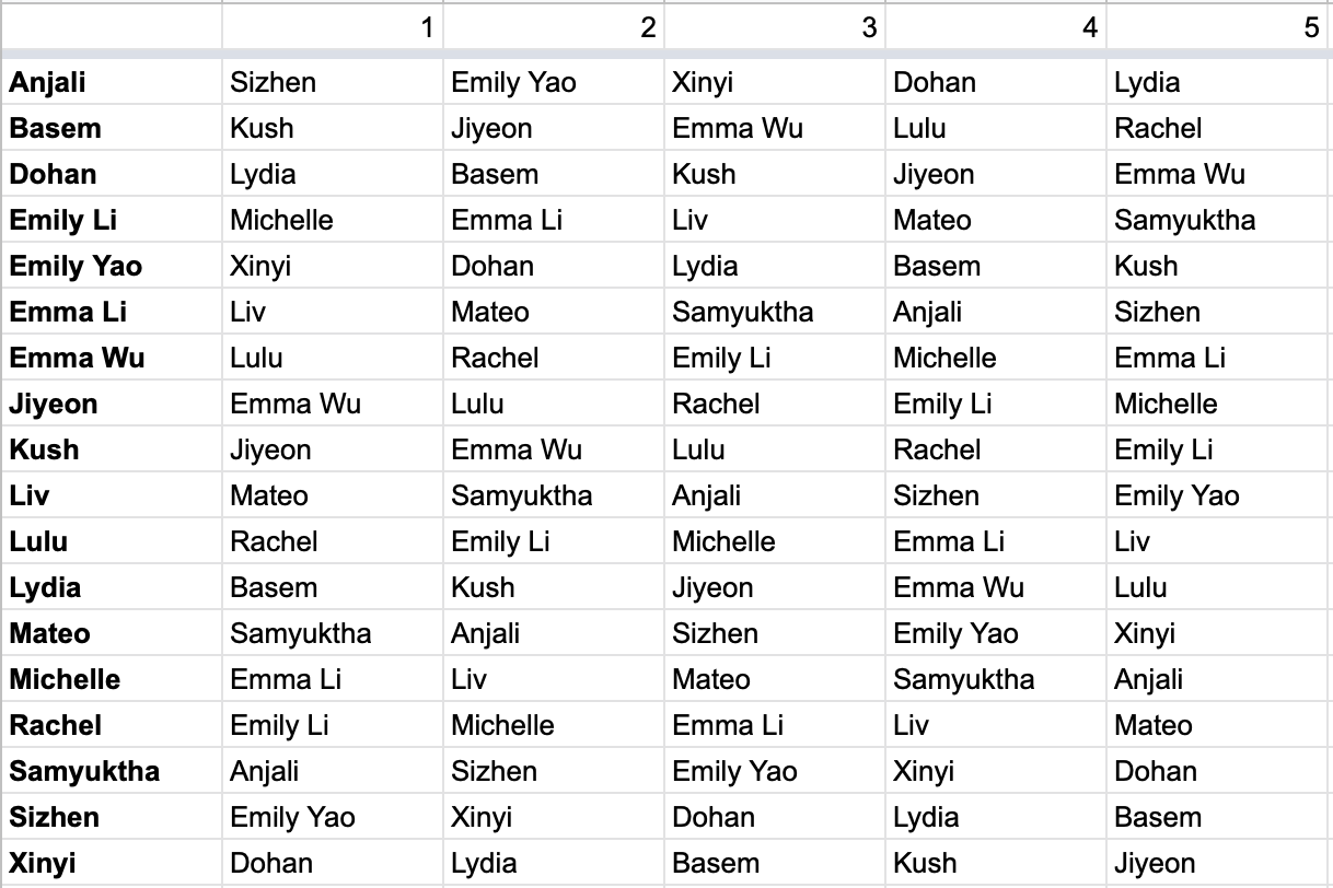
Written Feedback (due W 11.16)
Use this form to submit written feedback for five of your classmates’ book covers. Be candid, constructive, and detailed — think about the sort of feedback that would be helpful to you. See the table below for your assigned classmates (find your name in the left column and submit feedback for the five classmates in your row). In case the strike goes ahead this week, all responses will be publicly viewable here.
Wikibook (due M 11.21)
Tight Cover Comps: Having decided on a single direction for your cover, design three variations on a full book jacket, including a spine and back cover. Consider the book as a complete object: how you can continue the story told by your front cover onto your spine and back cover? Refer to Lulu’s Book Spine and Cover Best Practices to calculate your estimated spine width and set up the file correctly.
Complete Interior: Finish laying out your book interior.
W 11.09
CRITICAL READING (for M 11.14)Design for Sale: A Template for Magazine Design Sixteen Years in the (Re)Making
Discussion Captain: Jiyeon
ASSIGNMENT
Wikibook — due M 11.14
Cover: based on the feedback you received in class, develop 12 tight (~70% fidelity) cover comps from ~three concepts. Explore different ways to execute the same concept, by varying technique, typeface, color, size, etc. Compile your comps into a PDF and upload to the Inbox with the filename yourname_project6-covers-1114.pdf.
Interior: based on the written feedback you’ve received from your classmates and me, continue developing your book interior. You should have at least half of your pages laid out. Export a PDF and upload to the Inbox with the filename yourname_project6-interior-1114.pdf.
M 11.07
CRITICAL READING (for M 11.14)Design for Sale: A Template for Magazine Design Sixteen Years in the (Re)Making
Discussion Captain: Jiyeon
PRACTICAL READING/WATCHING
How a Book is Made
ASSIGNMENTS
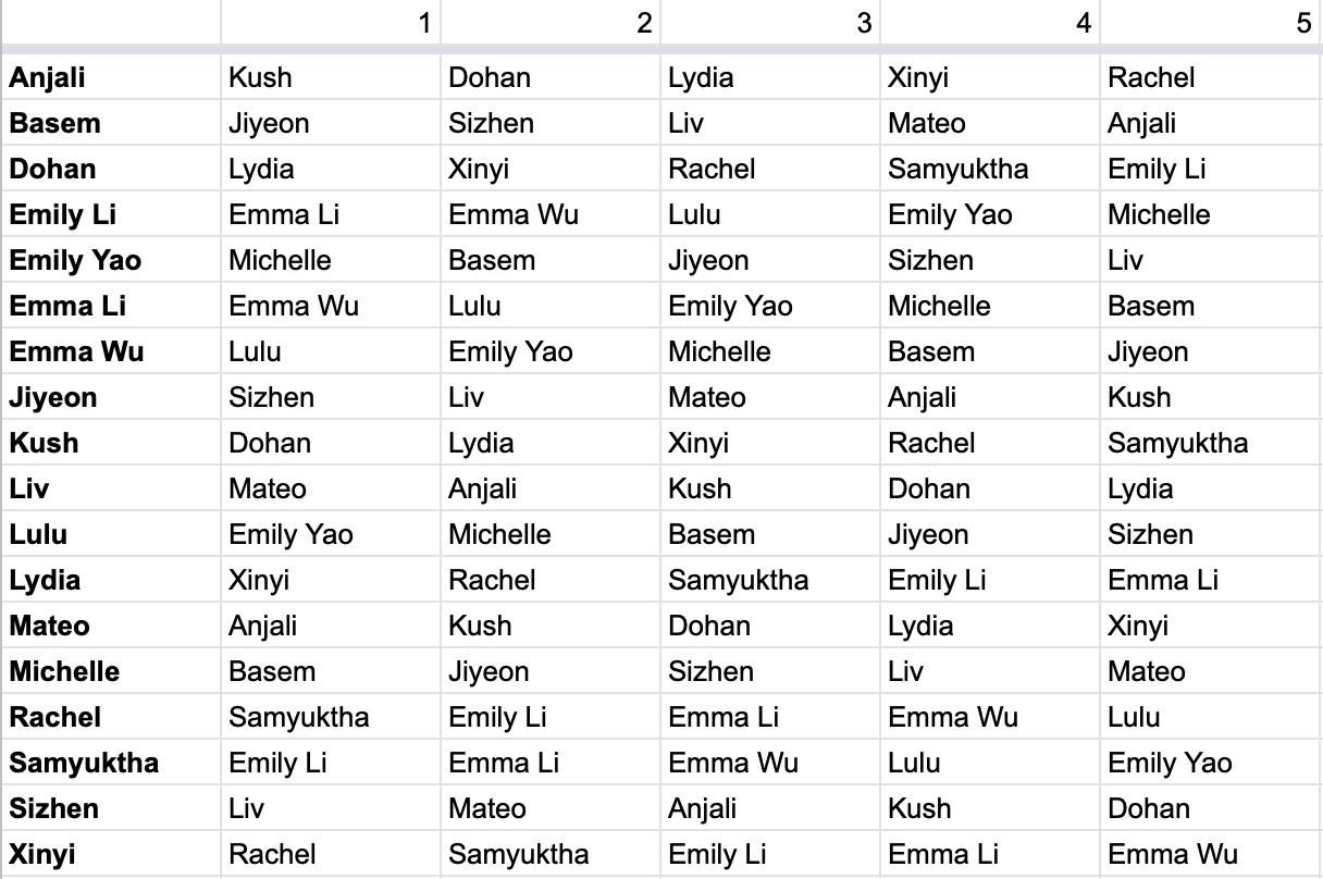
Written Feedback (due W 11.09)
Use this form to submit written feedback for five of your classmates’ book interiors. Be candid, constructive, and detailed — think about the sort of feedback that would be helpful to you. See the table below for your assigned classmates. I will compile the written feedback and send it to you on Wednesday.
Wikibook — due M 11.14
Cover: based on the feedback you received in class, develop 12 tight (~70% fidelity) cover comps from ~three concepts. Explore different ways to execute the same concept, by varying technique, typeface, color, size, etc. Compile your comps into a PDF and upload to the Inbox with the filename yourname_project6-covers-1114.pdf.
Interior: based on the written feedback you’ve received from your classmates and me, continue developing your book interior. You should have at least half of your pages laid out. Export a PDF and upload to the Inbox with the filename yourname_project6-interior-1114.pdf.
W 11.02
CRITICAL READING (for M 11.07)Through the Typographic Looking Glass
Discussion Captain: Lulu
ASSIGNMENT
See M 10.31
M 10.31
CRITICAL READING (for M 11.07)Through the Typographic Looking Glass
Discussion Captain: Lulu
PRACTICAL READING
Inside Paragraphs: Fine Tuning
ASSIGNMENT
WikiBook — for M 11.07:
Having established a clear direction for your interior layout, begin designing your book interior. Complete at least 24 pages. Export as a PDF with spreads and upload to the dropbox with the filename yourname-project6-interior-1107.pdf.
Additionally, sketch out 12 concepts for your book’s front cover. Consider what a cover does: it tells the reader something about the contents, and it invites them to read it. Use the tools at your disposal — abstraction, tension, narrative, subjectivity — to convey an idea.
Of these twelve concepts:
• at least three should use type in conjunction with image
• at least three should be solely typographic, no additional imagery
• at least three should incorporate handmade type/lettering
There may be overlap between these categories.
These concept sketches should be drawn with Sharpie on paper. What’s important, much more than the quality or fidelity of the drawings, is that they convey an idea clearly; unless a specific typeface is essential to a concept, you need not base your drawings on a typeface. Photograph your sketches and compile them into a PDF with the filename yourname-project6-covers-1107.pdf.
W 10.26
CRITICAL READING (for M 10.31)Interrogating the Euro-centric Design Canon
Discussion Captain: Samyuktha
ASSIGNMENT
WikiBook — for M 10.31:
Having received feedback on your conceptual directions, explore variations in how you will approach the book’s interior design. You may choose to vary such decisions as page size, grid, typefaces, type size, how type interacts with images, etc. (See examples of previous student work for this stage of the project here.)
If you are planning to print with lulu.com, consult their available page sizes. If you want your book to feel like a substantial object, consider a smaller page size (no larger than A5) so that your book will have more pages.
You will produce four layout directions, each with three representative two-page spreads; you may choose, for example, to show a spread with lots of text like the introduction; the table of contents; and a spread with a chart or image. Compile your work into a single PDF with the file name yourname-project6-1031.pdf and upload to the Inbox. You are also strongly encouraged to print at least one spread from each direction so that you may see what they look like at actual size.
M 10.24
CRITICAL READING (for M 10.31)Interrogating the Euro-centric Design Canon
Discussion Captain: Samyuktha
PRACTICAL READING
The Elements of Typographic Style: Shaping the Page Josef Mueller-Brockmann: Grid Systems
ASSIGNMENT
WikiBook — for M 10.31:
Having received feedback on your conceptual directions, explore variations in how you will approacht the book’s interior design. You may choose to vary such decisions as page size, grid, typefaces, type size, how type interacts with images, etc. If you are planning to print with lulu.com, consult their available page sizes. If you want your book to feel like a substantial object, consider a smaller page size (no larger than A5) so that your book will have more pages.
You will produce four layout directions, each with three representative two-page spreads; you may choose, for example, to show the introductory spread, a spread with several section headings, and a spread with non-text content like a table or diagram. Compile your work into a single PDF with the file name yourname-project6-1031.pdf and upload to the Inbox. You are also strongly encouraged to print at least one spread from each direction so that you may see what they look like at actual size.
W 10.19
CRITICAL READING (for M 10.24)Typography is a Grid
Discussion Captain: Rachel
PRACTICAL READING
Thinking With Type: Grid Systems
WATCH
Grid Systems: History & Context
(pw: CoreType)
READING/VIEWING ABOUT TYPEFACE PAIRING (for F 10.21)
The Value of Multi-Typeface Design by Bethany Heck
(article)
(video)
ASSIGNMENT
WikiBook
For M 10.24:
Having chosen your Wikipedia article, develop three conceptual directions for your book. Each conceptual direction should be represented by a moodboard of 20+ reference images; these images should include some amount of typographic material. Additionally, for each of the conceptual directions, develop four typographic palettes: headline (~36pt), subhead (~24 pt), text (~11pt), and caption (~10pt) — so in total, you should have three moodboards and 12 type palettes. Your palettes should take a range of approaches, from the monochromatic (i.e. a single typeface family) to the maximalist (i.e. different typefaces of different styles), and everything in-between. Read or watch “The Value of Multi-Typeface Design” (linked above) for direction on developing typographic voice through pairing. Compile your moodboards and palettes into a PDF with the filename yourname_wikibook-1024.pdf and upload to the Inbox.
M 10.17
CRITICAL READING (for W 10.19)Every Book Starts With An Idea
Discussion Captain: Emma Li
WATCH
What is a Book?
(pw: CoreType)
ASSIGNMENT
WikiBook (see full project description)
For W 10.20:
Find three articles that you might choose to use as your book’s content. Be ready to talk about why you chose each article. Prepare a text file with links to each page and upload it to the inbox with the filename yourname-wikibook-1019.txt.
W 10.12
CRITICAL READING (forEvery Book Starts With An Idea
Discussion Captain: Emma Li
ASSIGNMENT
Manifesto Poster
for F 10.14:
Based on the feedback you have received, prepare three final options for your Manifesto Poster. You will share these options in Lai’s class on Friday for feedback.
for M 10.17:
Once you have finalized your poster, export it as a PDF and upload it to both the Inbox and your student folder with the filename yourname_project5-final.pdf. Additionally, export a print-optimized PDF (use the PDF/x-1a:2001 preset) and upload to the “poster print files” folder in the Inbox with the filename yourname_project5-print.pdf. Your poster dimensions should be 700x1000mm.
M 10.10
CRITICAL READING (for W 10.12)What’s “Crystal Goblet” in Korean?
Discussion Captain: Dohan
ASSIGNMENT
Manifesto Poster — for F 10.14:
Based on the feedback you have received, prepare three final options for your Manifesto Poster. You will share these options in Lai’s class on Friday,
W 10.05
CRITICAL READINGFuck Content
Discussion Captain: Mateo
ASSIGNMENT
Manifesto Poster — for M 10.10:
Based on the feedback you received on your layout thumbnails and moodboards, design 12 700x1000mm poster comps. These comps should be at ~70% fidelity; you should begin caring about the details, but don’t fuss too much over them. In addition to your manifesto text, your poster should advertise an event related to your manifesto, so it must include an event title, date, and location. Your comps should represent variations on at least three separate conceptual directions. These comps can (should?) introduce color, texture, etc. but should still be entirely typographic in composition. Export a PDF and upload to the Inbox with the filename yourname_project5-1010.pdf.
M 10.03
CRITICAL READING (for W 10.05)The Crystal Goblet
Discussion Captain: Basem
SUPPLEMENTAL READING
Ellen Lupton: How Posters Work
ASSIGNMENT
Manifesto Poster — for M 10.10:
Based on the feedback you received on your layout thumbnails and moodboards, design 12 700x1000mm poster comps. These comps should be at ~70% fidelity; you should begin caring about the details, but don’t fuss too much over them. In addition to your manifesto text, your poster should advertise an event related to your manifesto, so it must include an event title, date, and location. Your comps should represent variations on at least three separate conceptual directions. These comps can (should?) introduce color, texture, etc. but should still be entirely typographic in composition. Export a PDF and upload to the Inbox with the filename yourname_project5-1010.pdf.
W 09.28
CRITICAL READING (for M 10.03)Style is Not a Four-Letter Word
Discussion Captain: Michelle
PRACTICAL READING
Inside Paragraphs, word space and line space, pp. 59–85
Detail In Typography, pp. 32–53
WATCH
Typography and Culture
(pw: CoreType)
ASSIGNMENT
Manifesto Poster — for M 10.03:
Stage 1: Layout Exploration
Within your selected manifesto text, identify 2–3 key phrases. These will serve as your “headlines.”
Using your manifesto text and headlines, design 48 700x1000mm, black-and-white layout variations. 24 of your layouts should use a modular grid (we used 12x18 in class but you can use whatever size grid you want) as a guide, while 24 should actively subvert conformity to a grid. You should explore various ways to create hierarchy by creating layouts with each of the following restrictions:
• 1 typeface, 1 style, 1 size
• 1 typeface, multiple styles, 1 size
• multiple typefaces/styles, 1 size
• 1 typeface, 1 style, multiple sizes
• 1 typeface, multiple styles & sizes
• multiple typefaces, styles, and sizes
You do not need any specific number of layouts for each restriction; simply use the restrictions as a guide to help you explore different strategies for creating hierarchy.
Print your layouts as thumbnails, 4 to a page. Also export as a PDF and upload to the Inbox with the filename yourname_project5-1003.pdf.
M 09.26
CRITICAL READING (for W 09.28)Under the Surface of Style
Discussion Captain: Emma Wu
PRACTICAL READING
History of the Poster
WATCH
History of the Typographic Poster
(pw: CoreType)
ASSIGNMENT
Manifesto Poster — project intro:
A manifesto, according to Merriam-Webster, is a written statement declaring publicly the intentions, motives, or views of its issuer. For this assignment you will choose a historical manifesto, research the author(s) and historical context, and create a typographic poster.
You will explore the use of typography, grid, color, shape, and scale to create a compelling composition. The poster should offer a vivid expression of the content at hand, and perhaps even insight into your perspective towards it. The composition must be completely typographic. There may be no photographic images or illustrations used. Instead consider the manipulation, presentation, intervention, and expression of typography as your primary visual language and image.
Combining words, you will explore the paragraph and how to typeset short writings. This project will support the understanding of hierarchy, balance and contrast but also introduce typographic terminology like leading, alignment, and more.
For W 09.28:
Select a manifesto you’d like to work with. Choose a passage of 100–200 words, and copy that text into a document. (If your manifesto is less than 100 words, copy the text in its entirety.) Below the manifesto text, answer the following questions:
• Who is/are the author(s) of this manifesto?
• What is the historical & social context in which this manifesto was written?
• Why does this manifesto resonate with you?
Upload this document (.rtf format preferred) to the Inbox with the filename yourname_project5-0928-text.rtf.
Additionally, assemble a moodboard of 40 images that relate to your manifesto. These images should speak to the manifesto’s subject, tone, and historic context, but they do not necessarily need to come from the same historic period or geographic location as your manifesto. Assemble these images into an 11x17” landscape artboard. Export as a PDF and upload to the Inbox with the filename yourname_project5-0928-moodboard.pdf.
MANIFESTO RESOURCES
10 Game Changing Art Manifestos
1000 Manifesto List
New School Library
OTHER POSTER REFERENCES
Margaret Anderson: The Radical Design Archive Preserving 100 Years of Political Graphics
Satyajit Ray
Roscoe Mitchell Sextet
Corita Kent
Markus Lange: Voices in Times of Political Tension
Karl-Heinz Drescher
Wolfgang Weingart
Ikko Tanaka
W 09.21
CRITICAL READING (for W 09.28)Under the Surface of Style
Discussion Captain: Emma Wu
ASSIGNMENT
Contemporary Typeface Presentation — due M 09.26
Research a typeface that was designed within the last 10 years and present your findings to the class in a five-minute presentation. Your selected typeface may be of any language/script. You are strongly encouraged (but by no means required) to purchase a license for this typeface.
Your presentation should include:
• Designer(s)
• Year Completed
• Information on the ideas/concepts behind the design
• Analysis of distinguishing design features
• Analysis of the anatomy of letterforms
• Any relevant technical information (Variable, Unique OpenType features, etc.)
• In-use examples (if available)
• In short: what interests you about this typeface?
Some sites you might use for research:
http://type.lol
http://fontsinuse.com
http://typecache.com
http://futurefonts.xyz
http://typefoundry.directory
Export your presentation as a PDF and upload to the Inbox as well as your student folder with the filename yourname-project4.pdf.
M 09.19
CRITICAL READING (for M 09.28)Under the Surface of Style
Discussion Captain: Emma Wu
ASSIGNMENT
Mantra Merch + Dynamic Words
Final Critique W 09.21
Finalize your merch design. Order a piece of merchandise with your design (such as a t-shirt or tote bag) from a direct-to-garment printer such as Zazzle or Redbubble. Alternatively, you may choose to DIY your merch by screenprinting or other methods. Upload a mockup of your merch to the class Inbox with the file name yourname-project3-merch_mockup.jpg.
Once you have received your merch (i.e not by W 09.21, but well before the end of the semester), take a well-lit photograph and upload it to your Dropbox folder with the file name yourname-project3-merch.jpg.
Produce your animation based on the feedback you received in class. Export it as a .gif, .mp4, or .mov and upload it to both your Dropbox folder and the class Inbox with the file name yourname-project3-animation.gif/.mp4/.mov.
W 09.14
CRITICAL READINGCult of the Ugly
Discussion Captain: Liv
READING FOR FUN
I’m Comic Sans, Asshole
WATCH
Spacing, Kerning, Tracking
(pw: CoreType)
ASSIGNMENT
Mantra Merch + Dynamic Words
For M 09.19:
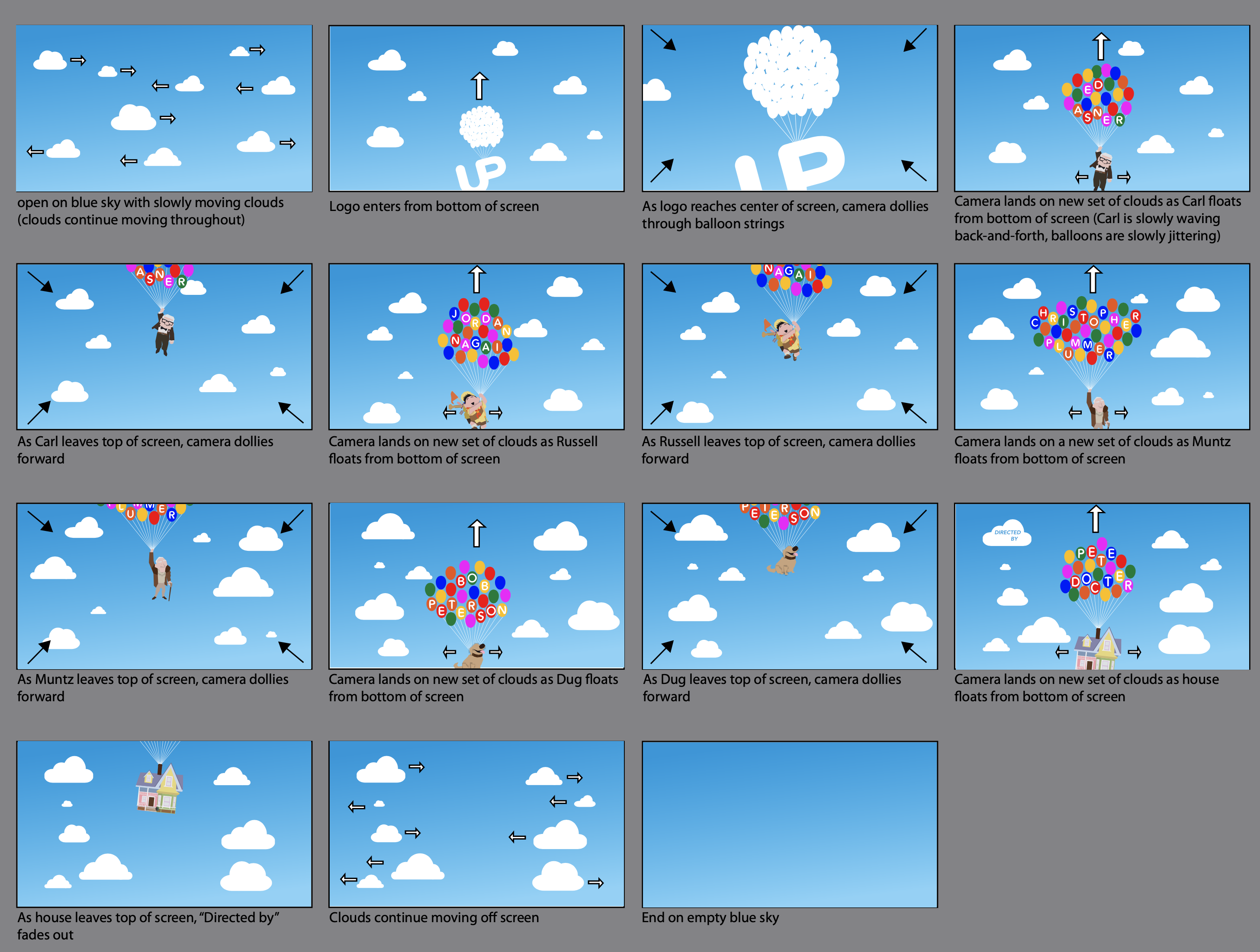
Present three final options for your static mantra. Mock each of them up on a piece of merch (i.e. a t-shirt, tote bag, etc.). Additionally, storyboard three concepts for animating your mantra (see example storyboard below). You may draw your storyboards using any tool you wish (i.e. pixels, vectors, ink). The animation should be square and black-and-white. Compile your mockups and storyboards into a single PDF and upload them to the Inbox with the filename [yourname]_project3-0919.pdf.
M 09.12
CRITICAL READINGThe Women Redressing the Gender Imbalance in Typography
Discussion Captain: Xinyi
PRACTICAL READINGS
Robert Bringhurst: The Elememts of Typographic Style, ch. 6
Cyrus Highsmith: Inside Paragraphs — Letter, Word, and Line Space (pp.44–71)
Emil Ruder: Typography, pp. 167–197
WATCH
How to Choose and Pair Typefaces?
(pw: CoreType)
ASSIGNMENT
Mantra Merch + Dynamic Words
For W 09.14:
Based on the feedback you received on your thumbnails, define three or four conceptual directions for proceeding with your mantra. Produce three or four iterations on each of these concepts, for 12 compositions total. These comps should still be 8x8 square, black and white, and entirely typographic, but now you should experiment with different typefaces and production methods.
Save as a PDF (one comp per page) and upload to the Inbox with the filename [yourname]_project3-0914comps.pdf. You do not need to print.
W 09.07
CRITICAL READINGTypography as a Radical Act in an Industry Ever-Dominated by White Men
Discussion Captain: Emily Li
PRACTICAL READINGS
Jost Hochuli: Detail in Typography, “Word”, pp. 23–31
Cyrus Highsmith: Inside Paragraphs, “How We Read”, pp. 26–43
Ellen Lupton: Thinking with Type, p. 87–107 “Text: Spacing, Kerning, Tracking”
WATCH
What Are Typefaces?
pw: CoreType
ASSIGNMENT
Mantra Merch + Dynamic Words
According to Wikipedia, a mantra is “a sound, syllable, word, or group of words that is considered capable of creating transformation.” For this assignment you’ll write or choose a personal mantra, then design and produce an actual wearable merchandise item (t-shirt, tote bag, or something similar) to showcase it. The mantra should be a short sentence or phrase, and should express a thought that you would like to either tell yourself or someone else every morning.
For Part 2 of this project, you will translate your mantra into dynamic content via animated GIFs. You will consider the translation of form, content, and meaning from a static physical object to a dynamic, screen-based format.
For M 09.12:
Create a 54-page document in InDesign with 8-inch-square pages. Using the typeface Acumin Variable Concept, create 54 individual black-and-white layouts of your mantra. Lay out the words to enhance the meaning of your mantra. Vary the placement, scale, and weight and width of your words. Print your pages as thumbnails, nine to a page (see below).
W 08.31
NO CLASS MONDAY — LABOR DAYCRITICAL READING
Type Choice, Political Choice by Agyei Archer
Discussion Captain: Anjali
PRACTICAL READINGS
John Kane, a Type Primer — anatomy of letterforms
Cyrus Highsmith, Inside Paragraphs: How Type Works
WATCH
Anatomy of Letterforms
pw: CoreType
ASSIGNMENT
Cropped Letter (due W 09.07)
In this project, you will use letterforms and cropping to create typographic patterns and textures. There will be a strong focus on composition and letterforms as a fundamental element in communication design.
Type a capital letter in Helvetica Bold at 200 pt on an 8.5x11(letter) page in Illustrator. Create a 1.5-inch square over this letter and make a clipping mask. Duplicate this object so that you’re left with a 4x4 grid, or 16 squares. Rotate, scale (uniformly; do not stretch or squash the letterforms), and adjust the position within each crop to make an interesting overall composition. Pay close attention to the balance of positive and negative spaces. Repeat this method to make a total of 16 full compositions using three more typefaces: four (4) using Helvetica Bold, four using Adobe Caslon Regular, four using Bodoni URW Medium, and four using Clarendon URW Medium. These typefaces are either pre-installed on your system or available at fonts.adobe.com with a Creative Cloud subscription. If you do not have a Creative Cloud subscription, contact me about alternatives.
Each composition can be made using a different letter. All letters must be capitalized. Only one letter per composition. (1 sheet = 1 composition) Make certain to use the correct typeface!
Each sheet should be in portrait (vertical) format. All squares should be in perfect alignment; each full composition should be centered on the page. Watch for tiny details in your compositions (stray marks, unintentional white lines, etc.)
Print each page (all 16!) and bring them to class. Additionally, export a PDF named yourname_project2.pdf and upload to both the Inbox and your individual student folder on the class Dropbox.
M 08.29
Please complete the entrance survey.CRITICAL READING
The Mystery Font That Took Over New York
(web archive if you can’t get around the paywall)
PRACTICAL READINGS
The Elements of Typographic Style, Ch. 1
Bruno Munari, The Shape of Words
ASSIGNMENT
Typographic Pecha Kucha (due W 08.31)
Find 5–7 examples of typography or lettering that provoke a reaction in you, whether that reaction is excitement, disgust, sadness, awe, etc. These should be examples that you find and photograph in the wild; they should not come from the internet.
Assemble your examples into a presentation with one photograph per slide. Be prepared to talk about each slide for 20–30 seconds — what about this type caught your attention? Export your presentation as a PDF and upload to both the Inbox and your student folder on the Dropbox with the file name “yourname_project1.pdf”
© 2025 Eric Doctor. All Rights Reserved.